Fields/Sections - General Settings

Customer Support
Last Update 2 年前
General Settings that you can apply to all types of fields.
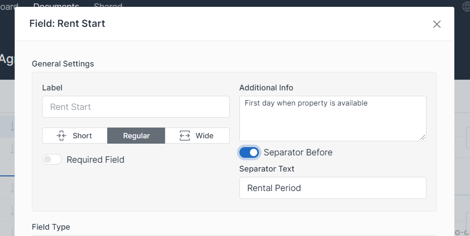
Label
Main label for field
Default: Key from template
Size
You can decide how much space on form particular field will take. You have three options:
- Short (you can fit 3 fields in one row on desktop device)
- Regular (you can fit 2 fields in one row on desktop device)
- Long (field take whole row, regardless the device)
Keep in mind that on smaller / mobile devices size could be adjusted and fields will be display one by one regardless of this setting.
Default: Regular
Required (Optional)
If you mark this checkbox for specific field, form cannot be submitted without filling in this field.
If you mark this field for section at least one item should be added or checkbox will be mandatory.
Field with Required flag will receive * asterisk close to label.
Default: Not Required
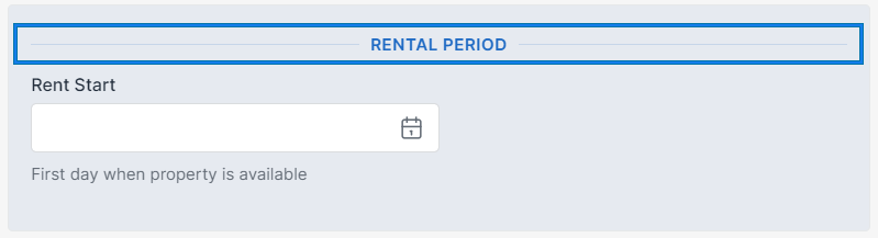
Additional Info (Optional)
Additional Information that will be visible just under field.
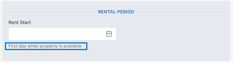
Default: Not defined
Separator (Optional)
You can split your form into parts separated by new line and optionally by some name
Separator Name (Optional)
Default: Not defined